


Cardiff University Data Lab for Social Good EPSRC JSI


Session 2  ·  13:00 to 14:30

Getting the forecasting methods right

Which method for which situation, and how the context you already hold makes any of them better


Udeshi Salgado, Cardiff University, UK
Supervisors: Prof. Bahman Rostami-Tabar, Dr Thanos E Goltsos, Dr Geraint Palmer, Dr Paul Wang
Data Lab for Social Good, Cardiff University, UK
JSI Advisor: Dr Laila Akhlaghi (John Snow, Inc.)

Better Vaccine Demand Forecasting  ·  Maputo, Mozambique  ·  2 September 2026


Outline

  • What are we actually forecasting?
  • Which method, and when
  • Using what you already know
  • What we found


Outline

  • What are we actually forecasting?
  • Which method, and when
  • Using what you already know
  • What we found

From the process to the methods

Stage 1The decisionWhat decision does the forecast drive, and over what time frame?
Stage 2Target variableWhat exactly are you forecasting, and in what units?
Stage 3Shape & scheduleHow far ahead, how often, and a single number or a distribution?
Stage 4InputsWhat data you actually have, and what it really means
Stage 5Contextual challengesThe traps that appear once the target meets the dataWhere this session sits: a model-agnostic way to embed operational domain knowledge in the forecast distribution
Stage 6ModelThe method, chosen after everything above, not before
Stage 7EvaluationHow you know it is good enough to act on
Stage 8DeploymentWhat it takes to run it for real

The target variable: three different numbers, often called by one name

Doses administered What children actually receive at the session. This is what your registers and DHIS2 record. The number you have the most data about.

Consumption Doses administered plus wastage: open vial losses, breakage, expiry, cold chain failures. The number that leaves the store.

Procurement quantity Consumption plus buffer stock, plus a margin for lead times and losses in transit. The number you actually order.

Most of your data speaks about the first. Most of your decisions are about the third. Before comparing any two methods, check which of the three each one is forecasting.

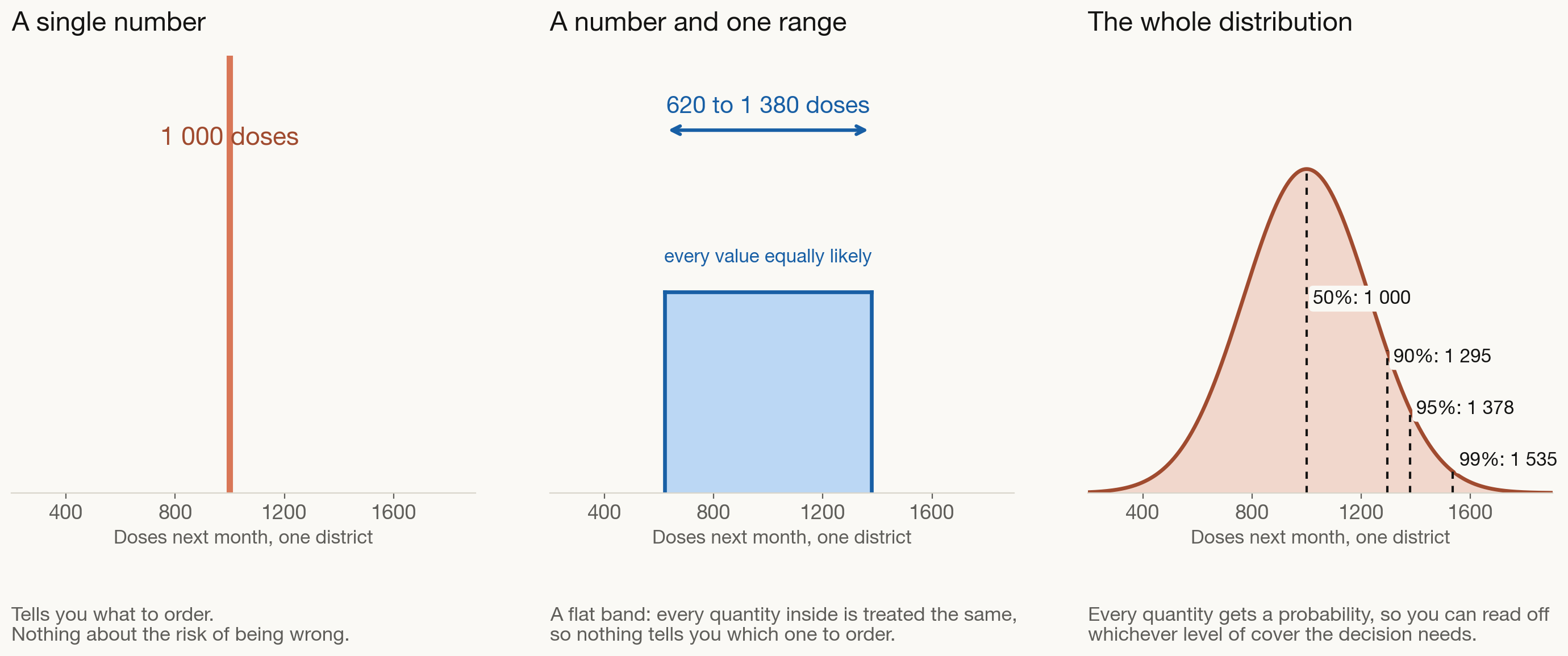
Output type: a single number, one range, or the whole distribution?
What good looks like

  • A number and a distribution, not just one range, so buffer stock is chosen rather than guessed
  • Compared against a simple method, so you know the extra effort is buying you something
  • Repeatable by someone else next year, when a different person is in the chair


Outline

  • What are we actually forecasting?
  • Which method, and when
  • Using what you already know
  • What we found

Where FSP4All sits in this picture

FSP4All answers the question three ways at once, then blends the three into one annual figure. Each of the three components needs a different kind of data.

Demographic eligible children × the coverage expected at each dose, added up across the schedule Needs: population projections, coverage targets, the dose schedule Available to us

Consumption based average the last twelve months of issues, then carry it forward Needs: wastage rates, reporting rates, days out of stock Not in our dataset

Session based add up every planned session and the attendance expected at each Needs: microplans and recorded attendance per session Not in our dataset

One annual procurement figure Whichever components are available are weighted together into a single number, with no month-to-month detail and no measure of uncertainty around it.

The demographic component is the one we could compute, so it is the one our method builds on. Read that way, FSP is less a forecaster than a store of demographic knowledge, and that knowledge is exactly what a data-driven forecast lacks.

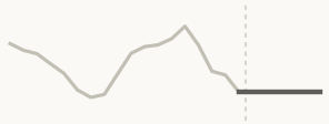
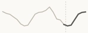
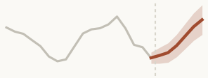
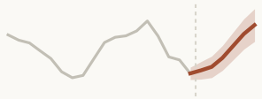
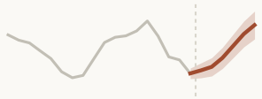
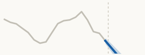
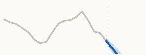
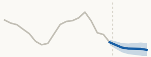
What each family actually does to your history
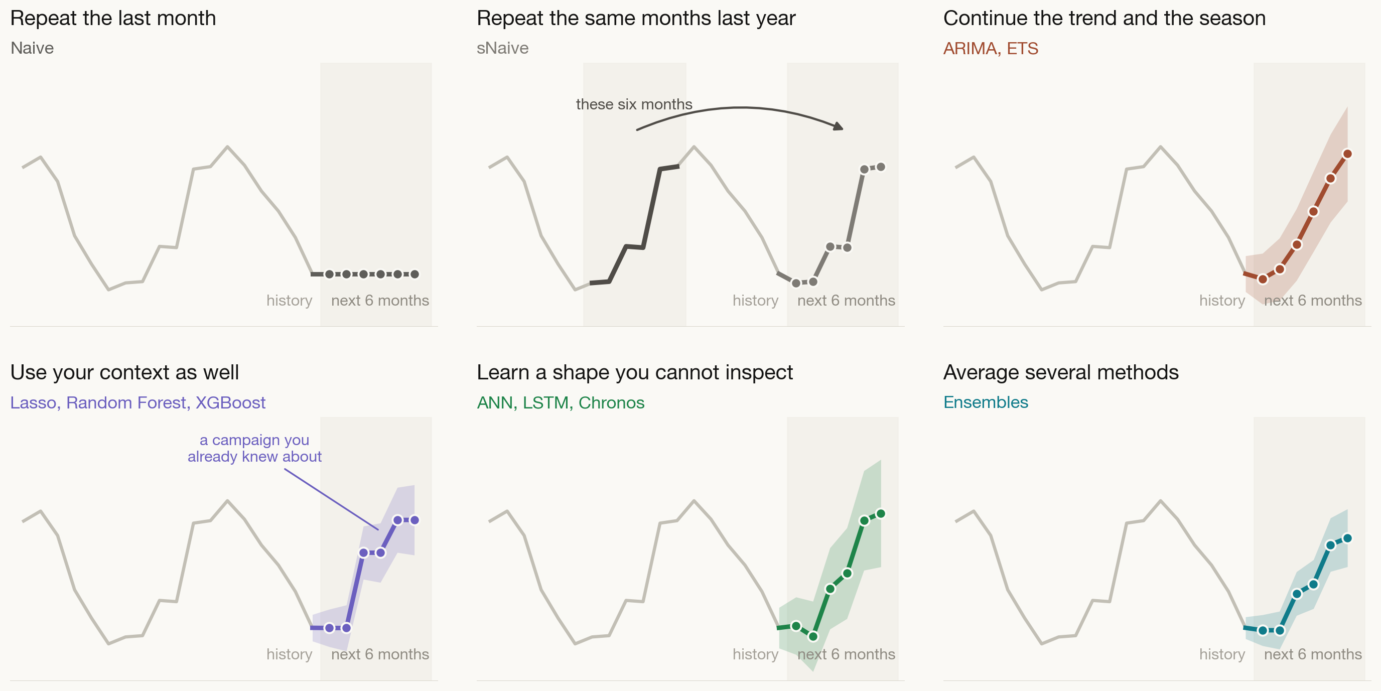
Model complexity and explainability: how simple can you get away with?
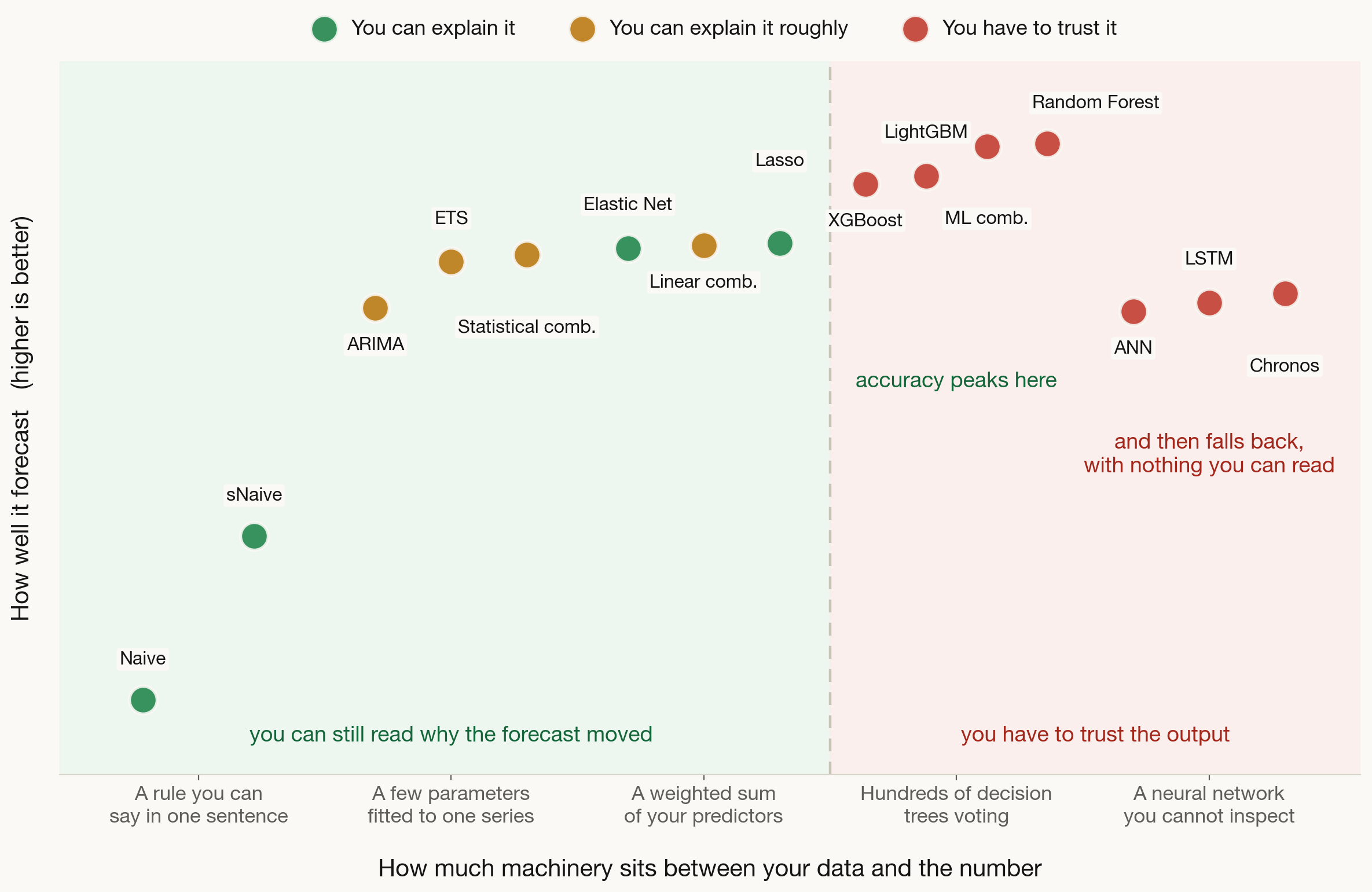
The accuracy against explainability trade-off is the standard framing in the explainable-AI literature (Gunning and Aha, 2019, AI Magazine 40(2), Figure 1). The points here are our own fifteen methods on the study’s district-level data.

Method by method (1 of 3) · simple benchmarks and statistical

Method What it assumes Pros Cons Can you explain it Suitable context
NaiveSimple benchmark The immediate future looks exactly like the most recent past. No trend and no seasonal cycle in the data. Instant, nothing to tune, and the honest floor every other method has to beat. Ignores trend, season and everything else you know about the programme. ●●●Easy Very volatile series with no clear pattern. Always, as a starting baseline.
sNaiveSimple benchmark The seasonal pattern repeats exactly as it did last year, and no underlying trend is pushing the level up or down. Carries the seasonal shape with no modelling at all. A strong seasonal baseline. Copies last year’s stockouts and shocks along with the pattern. Ignores growth. ●●●Easy Stable repeating seasonality. The baseline to beat for seasonal data.
ARIMAStatistical Statistical behaviour is stable over time, relationships are strictly linear, and the errors are uncorrelated and normally distributed. Picks up both short and long term structure from few parameters. Raw data can follow any distribution. Fails on non-linear patterns, is sensitive to outliers, and loses accuracy over long horizons. ●●Moderate One series at a time, linear structure, short to medium horizons.
ETSStatistical Errors have zero mean, constant variance and a normal shape. Data stays strictly positive wherever the seasonality is multiplicative. Models level, trend and season together, copes with short histories, and damps long-horizon over-forecasting. One series at a time, fails when the data contains zeros, and has many parameters to optimise. ●●Moderate Positive data with changing seasonal patterns, and small datasets.
Statistical averageEnsemble of Naive, sNaive, ARIMA and ETS The members are equally good, their errors are uncorrelated and cancel each other out, and the weights stay stable. Cuts the variance of any single member with a plain average and no weights to tune. Gives weak members the same weight as strong ones, and cannot adapt when one clearly dominates. ●●Moderate Pooling Naive, sNaive, ARIMA and ETS into one robust baseline.

Method by method (2 of 3) · machine learning

Method What it assumes Pros Cons Can you explain it Suitable context
LassoRegularised linear A linear relationship between predictors and demand, errors that are independent and of constant spread, and a stable bias-variance trade-off. Drops predictors that do not earn their place, so what is left is short and readable. Biases the coefficients it keeps, and picks arbitrarily among predictors that move together. ●●●Easy Many predictors where you want a sparse, interpretable model.
Elastic NetRegularised linear The same linearity, independent errors and constant error spread as Lasso, plus a feature mapping that stays stable over time. Keeps groups of correlated predictors together instead of discarding all but one. Steadier than Lasso. Two settings to tune instead of one, which makes cross-validation slower. ●●●Easy Many correlated or redundant predictors, where plain regression is unstable.
Linear averageEnsemble of Lasso and Elastic Net The underlying relationships are linear, the members’ errors are uncorrelated, and they share the same feature space. Smooths out the difference between the two penalties, with nothing to tune. Inherits every limitation the linear members share, so it still cannot handle curved patterns. ●●Moderate Stabilising forecasts built on many correlated predictors.
Random ForestTree ensemble The mapping from the inputs you feed it to demand is structurally stable, and the individual trees are independent of one another. Captures non-linear patterns, copes with missing values and outliers, and takes in as much context as you have. Cannot forecast above anything it saw in training, is the slowest of this family, and is a black box. ●●Hard Many districts at once, complex interactions, plenty of context features.
XGBoostTree ensemble A stable input-to-demand mapping, corrections that add up across successive trees, and a genuine ordering inside any number-coded category. Very high accuracy, built-in guards against overfitting, handles gaps natively, and ran in 24 seconds. Cannot extrapolate beyond the training range, is sensitive to its settings, and is a black box. ●●Hard Large multi-district datasets where speed and accuracy both matter.
LightGBMTree ensemble The same stable mapping and additive corrections, plus a gradient-based loss good enough to decide where each tree grows next. The lightest and fastest of the family, handles categories natively, and gave the best accuracy per second here. Cannot extrapolate, overfits smaller datasets easily, and has many settings that interact. ●●Hard High volume data, roughly ten thousand observations or more.

Method by method (3 of 3) · ensembles, deep learning and foundation models

Method What it assumes Pros Cons Can you explain it Suitable context
Tree averageEnsemble of Random Forest, XGBoost and LightGBM The tree members are structurally diverse, their split relationships stay stable, and their errors are symmetric. Smooths the differences between tree models and handles interactions natively, with no weights to optimise. Still cannot extrapolate beyond the training range, and offers no interpretability at all. ●●Hard Averaging Random Forest, XGBoost and LightGBM into one steadier forecast.
ANNDeep learning Information flows one way through fully connected layers, neurons in the same layer do not talk to each other, and each layer uses one activation function. Models very intricate non-linear relationships straight from the raw inputs. Blind to chronological order, needs hours of training and large samples, and is uninterpretable. ●●Hard Static multi-variable problems where sequence is not what drives demand.
LSTMDeep learning Chronological dynamics are stable, the order of the months drives the outcome, and there is enough history to train on. Remembers across long stretches of history and models sequence directly, with no feature engineering. Hours to train, needs large samples to avoid overfitting, and is a complete black box. ●●Hard Long, deep patterns over time in genuinely large datasets.
ChronosFoundation model Language-model architectures carry over to time series, recent history is enough context, and the pretraining data resembles yours. Forecasts with no training at all, returns a range out of the box, and is quick to put in place. Bounded by a fixed vocabulary, heavy every time it predicts, and risky if your data is unusual. ●●Hard Too little history to train your own model, or a rapid deployment.


Outline

  • What are we actually forecasting?
  • Which method, and when
  • Using what you already know
  • What we found

You need a new, better model You need to use the context you already hold The largest gains in our study did not come from a more advanced forecasting model. They came from telling an ordinary model what a district can physically do.

Covariables: the context is already sitting in your files

Where it already lives
What it gives the forecast

  Your annual planning file Target population for each district
Coverage targets, national and WHO
The dose schedule for each antigen

The ceiling The most doses a district could plausibly deliver in a month. FSP4All already computes this for you.

  Routine reporting Past doses administered, monthly, by district and antigen

The forecast itself The level, the trend and the seasonal shape that any method learns from.

  The programme calendar Campaign and session dates, known months ahead
Floods, drought, epidemics and public holidays

Extra drivers Things a machine learning method can learn from, and that a pure time series method cannot see.

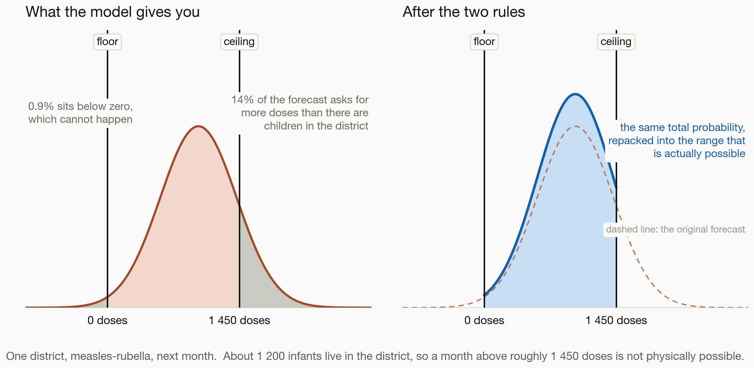
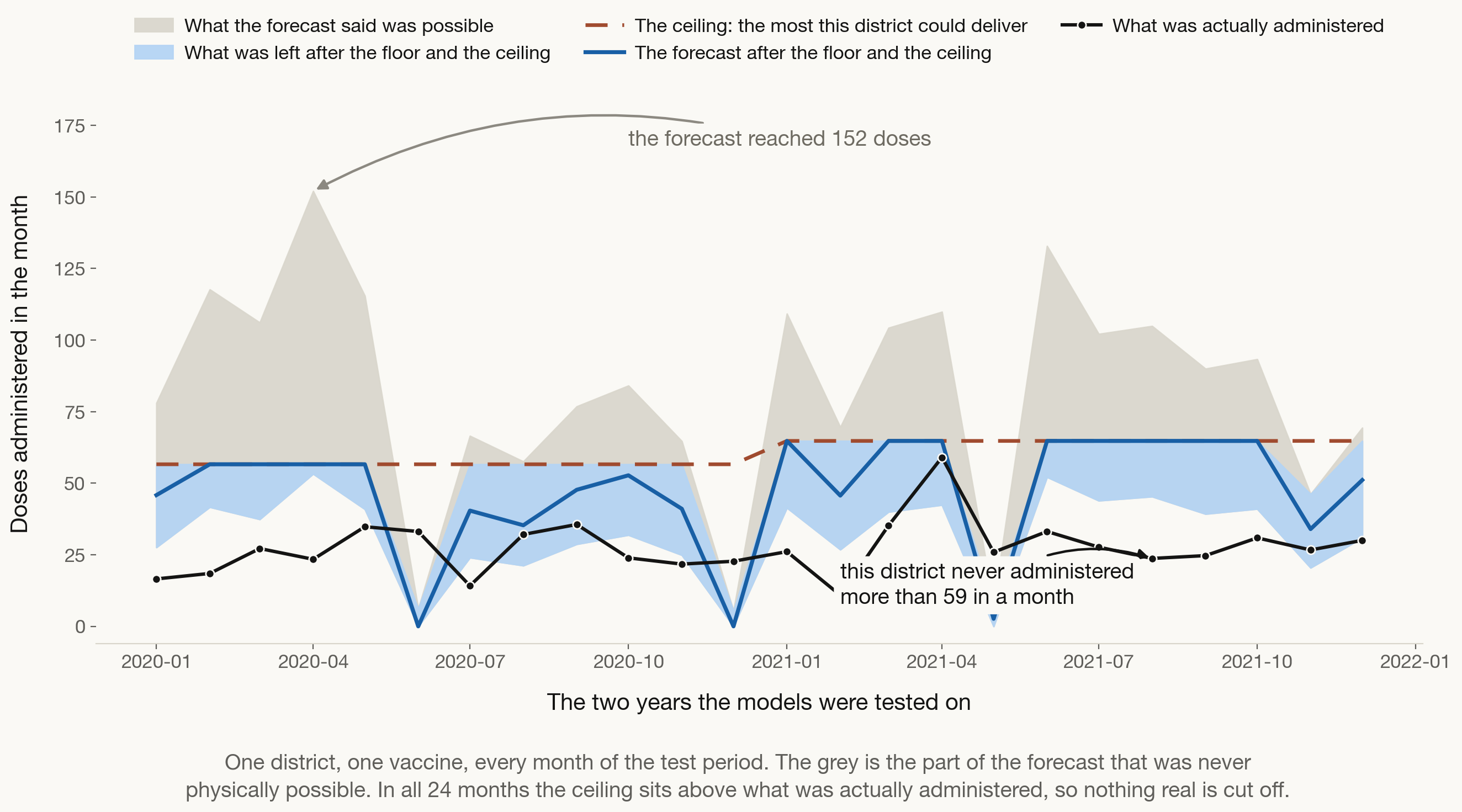
A forecast range should not contain the impossible

Any method that gives you a range gives you a range of numbers. It does not know which of those numbers a district could actually deliver.

1 A floor A district cannot administer a negative number of doses. Every value below zero in the range is wasted probability.

2 A ceiling A district cannot vaccinate more children than live there. Beyond that ceiling, the range is describing something that cannot happen.


We take the probability that the model put on impossible quantities, and we move it back into the range that is possible. Nothing else about the model changes.

A simple example

A fair question: does this only work if you assume a bell curve?
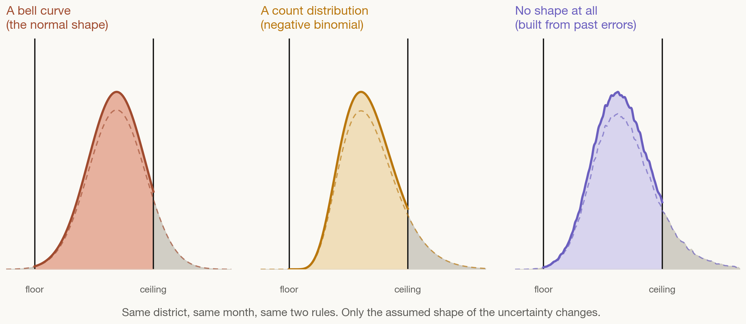
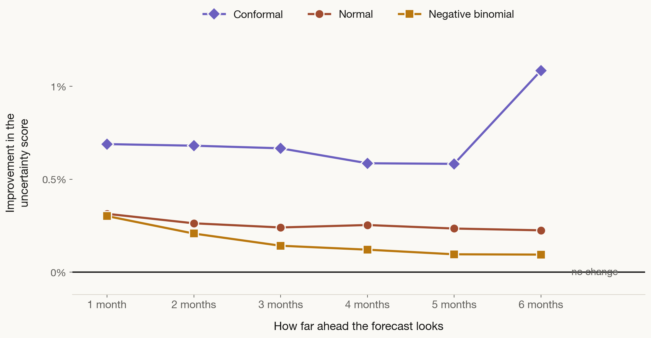
We ran the whole study three times: assuming a bell curve, assuming a count distribution, and assuming no shape at all, building the range purely from past forecast errors.

Where the ceiling comes from

The ceiling is built from the numbers your programme already produces, in two steps.

Step 1 · The plan

The demographic estimate you already compute:

\[E = \tfrac{1}{12} \times \text{target population} \times \!\!\!\sum_{\text{each dose}}\!\!\! \text{coverage at that dose}\]

Coverage falls across the schedule, so the per-dose coverages are added up rather than one coverage multiplied by the number of doses.

Step 2 · A reality factor

Real districts sometimes exceed the plan: catch-up, outreach, children crossing from a neighbouring district.

\[U = k \times E\]

\(k\) is learned from your own history, set high enough that only the top 2.5% of past months sit above it.


The ceiling deliberately sits above the plan, so that a genuine surge is never cut off. It only removes quantities no district has ever come close to delivering.

Two rules, and they sit on top of any method

Whatever you already use

The demographic method what FSP4All already gives you

Trend and season models ARIMA, ETS, same month last year

Machine learning random forest, boosting

Deep learning and AI models neural networks, pre-trained models

Each one produces a forecast with a range around it

Apply the floor nothing below zero doses

Apply the ceiling nothing above what the district’s children allow

Repack the probability the impossible share moves into the possible range

The same method, now producing a forecast a district could actually deliver


Outline

  • What are we actually forecasting?
  • Which method, and when
  • Using what you already know
  • What we found

What we tested it on

5 vaccines BCG · Pentavalent · Measles-Rubella · OPV birth · OPV routine

306 districts 1 530 series, the level where the stock decisions are made

Tested on 2020 and 2021 trained on history the model never saw the test years in

15 methods, 5 families statistical · machine learning · deep learning · foundation · ensembles

3 ways of expressing uncertainty no shape assumed · a bell curve · a count distribution

220 320 forecasts per method and per uncertainty shape, up to 6 months ahead

The point of the study is not to crown a winning method. It is to ask whether adding the feasibility bound helps, whatever method and whatever uncertainty shape you started from.

What this looks like in one real district
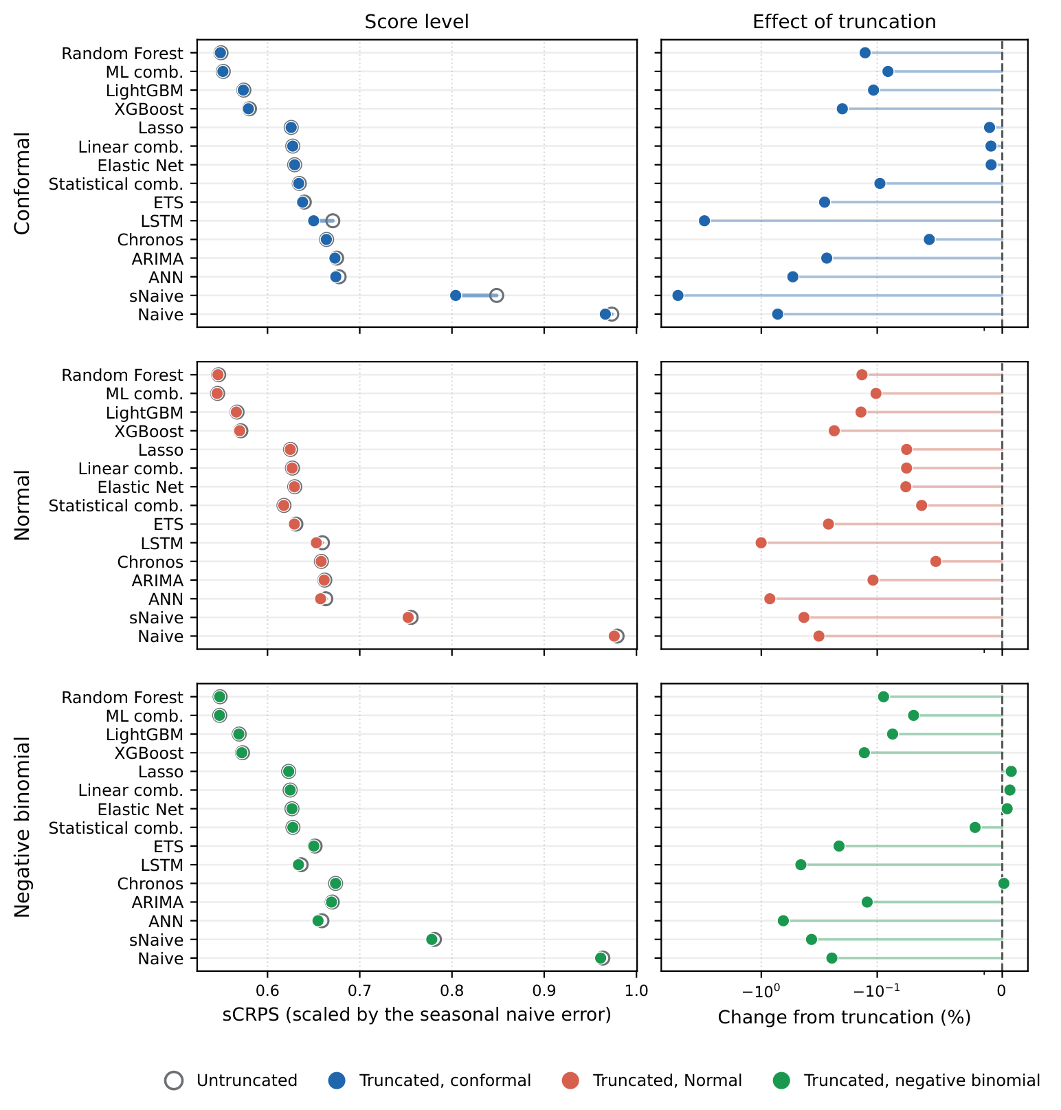
Scaled CRPS, before and after
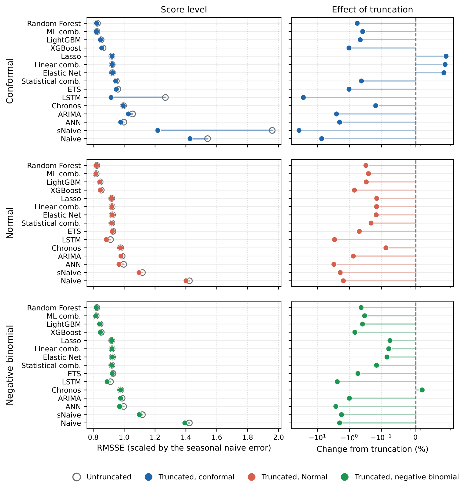
RMSSE and MASE, before and after
What contextual truncation did

15 of 15 methods forecast better once the floor and the ceiling were applied

14.7% cheaper stocking decisions at a 99% service level, and 78% cheaper for the weakest method

0.24% of months where real demand ever went above the ceiling, so almost nothing genuine is cut


  • It worked under all three ways of expressing uncertainty, and at every horizon from one to six months
  • The gain is largest where forecasts were most spread out, near zero where they were already tight, and no method was worse off

Decision metrics: scoring what the decision cares about
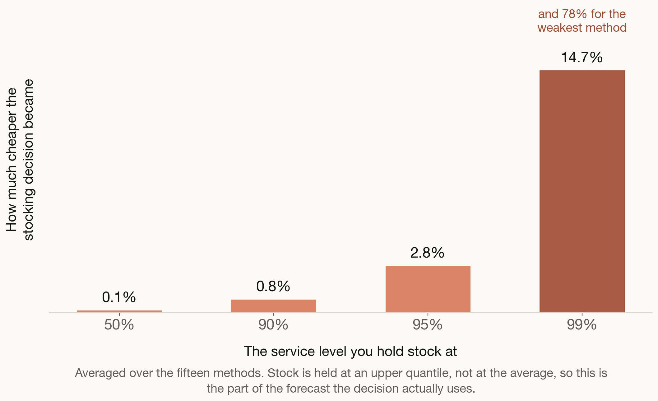
You do not order the average. You order enough to cover demand most of the time, and that decision lives in the upper tail, which is exactly where the impossible forecast was sitting.

The bound buys sharpness without losing calibration: the ranges get narrower, and realised demand still falls inside them in 99.76% of months.

Where the gain lands across the methods
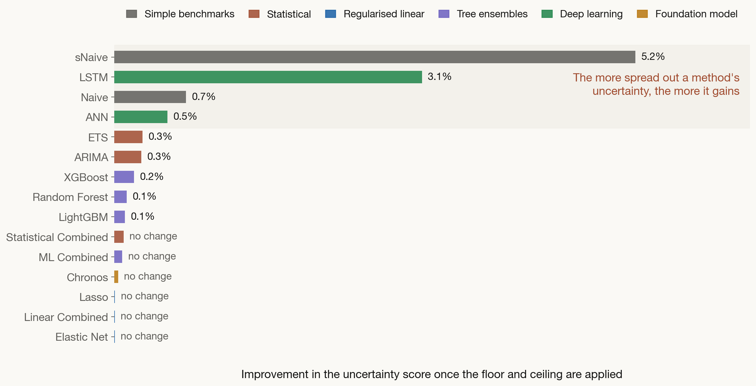
The simplest method is the one that gains the most

sNaive, on its own

  • Repeats what happened in the same months a year ago
  • Needs only its own history: no population file, no context features, no extra reporting
  • Runs in about two minutes on any laptop
  • Anyone in this room can explain exactly how it got its number

sNaive, with contextual truncation

  • Point error down 38% (RMSSE) and 41% (MASE)
  • Stocking decision at a 95% service level: 23% cheaper
  • At a 99% service level: 78% cheaper, the largest gain of any method
  • Still costs two minutes, still needs no new data, still fully explainable


Being honest about the limit: even after truncation sNaive does not overtake the machine learning methods on the full distributional score. What it does is close a large part of the operational gap using nothing you do not already have.

What to take home

  • There is no single best method. Match the method to the data you actually have, and to the decision it has to support.
  • Always keep a simple benchmark. “Same month last year” costs nothing and tells you whether a sophisticated method is earning its keep.
  • Ask every method for a range, not just a number. Buffer stock is a decision about uncertainty, so the forecast has to describe uncertainty.
  • The context you already hold is worth more than a more advanced model. Population, coverage and the dose schedule are already in your planning files, and no new data collection is needed.
  • The simplest method gains the most. “Same month last year” plus the two rules costs two minutes, needs no data you do not already have, stays fully explainable, and its stocking decision at a 99% service level became 78% cheaper.

Any questions or thoughts? 💬

Visit my website for these slides

Appendix

Every method improved, whatever shape was assumed
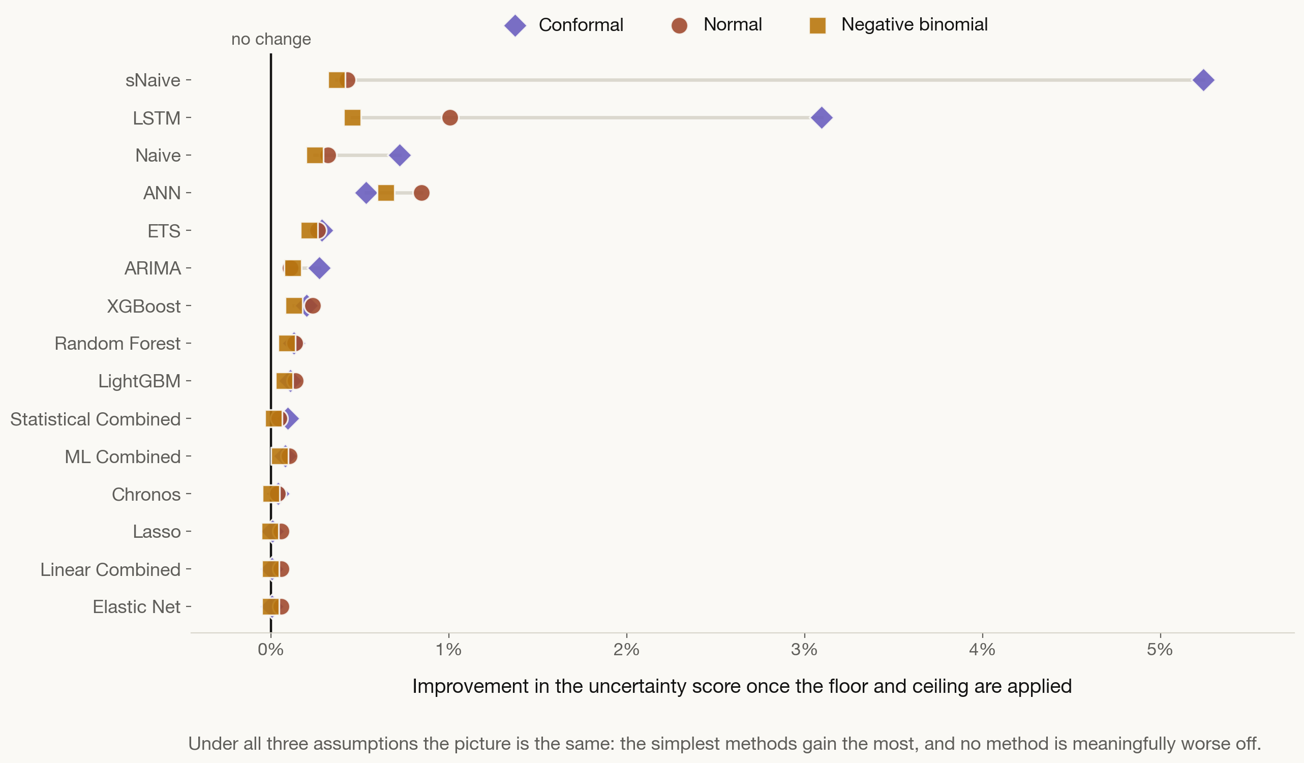
Better for all 15 methods under two of the three shapes, and 11 of 15 under the third, where the other four move by less than 0.005%. No method is significantly worse anywhere.

Why the service level matters

You do not stock to the average You hold enough to cover demand most of the time, at a 90%, 95% or 99% service level. That decision lives in the upper tail of the forecast, not at its centre.

The upper tail is where the impossible sits The higher the service level, the further into implausible territory the forecast reaches, and the more the ceiling has to remove. At the 99% level the cost of the stocking decision fell by 15% on average, and by 78% for the weakest method.


Point accuracy, and every horizon

Point accuracy improves for all 15 methods under the bell curve, 14 under the count distribution, and 12 under no assumed shape. The benefit neither fades nor spikes with lead time.

Why it works
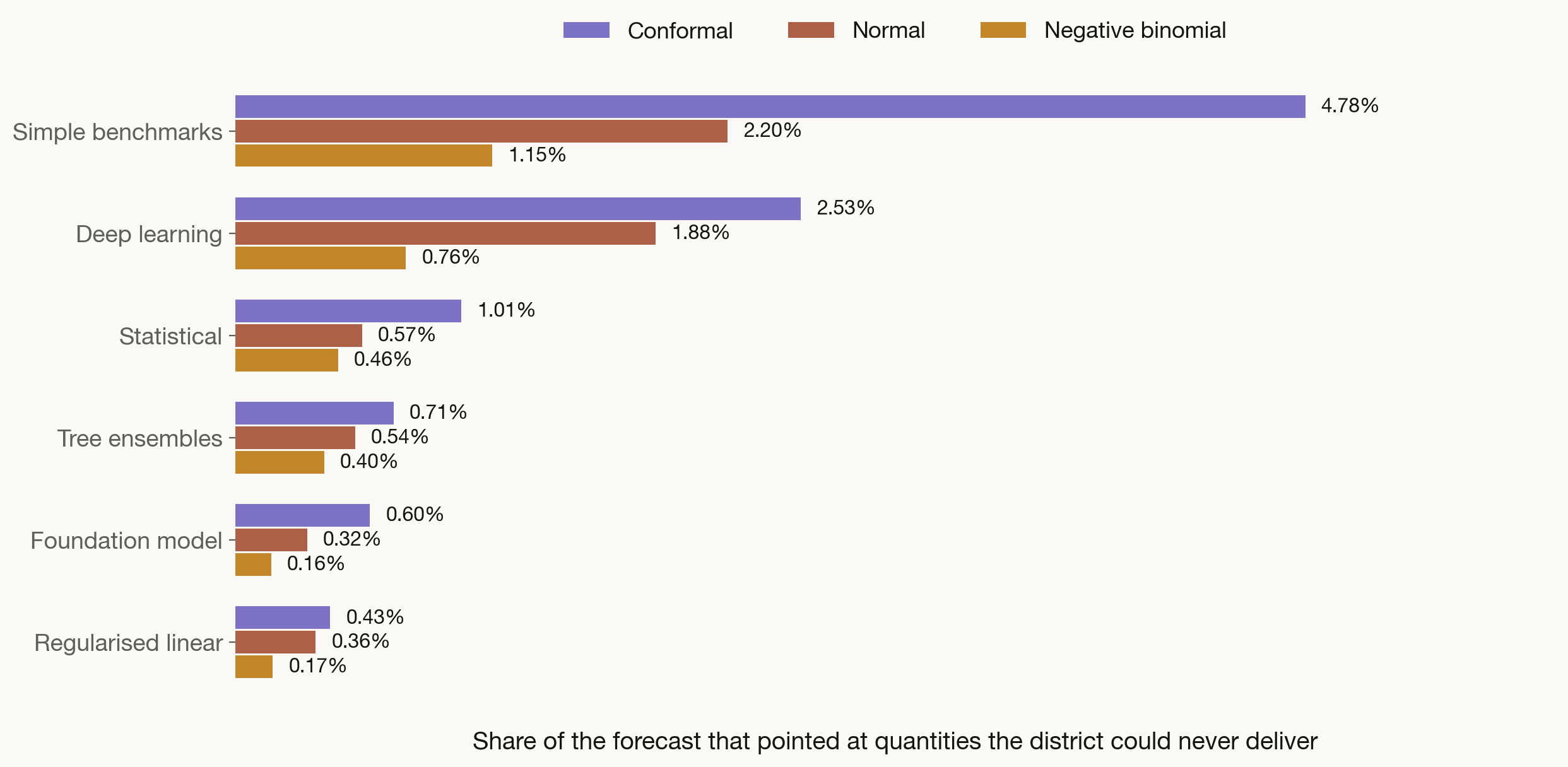
The bound binds where the forecast is wrong

What decides the size of the gain

  • Not how often the ceiling is touched, but how much misplaced probability it removes when it is
  • The ceiling is touched on 12% of forecasts for the sharpest methods and 96% for the weakest
  • None of the forecasting methods is given population data, so the spread alone explains the difference

And it does not cut real demand

  • Across the whole test panel, actual demand went above the ceiling on only 0.24% of occasions
  • The bound is deliberately set above the plan, at the 97.5th percentile of what districts have really delivered
  • So it removes the implausible without excluding the demand that genuinely occurs


This is why the rule can be applied across a whole portfolio of methods rather than picked and chosen: it repairs the over-spread forecasts and leaves the well-behaved ones almost untouched.

What a monthly series actually looks like
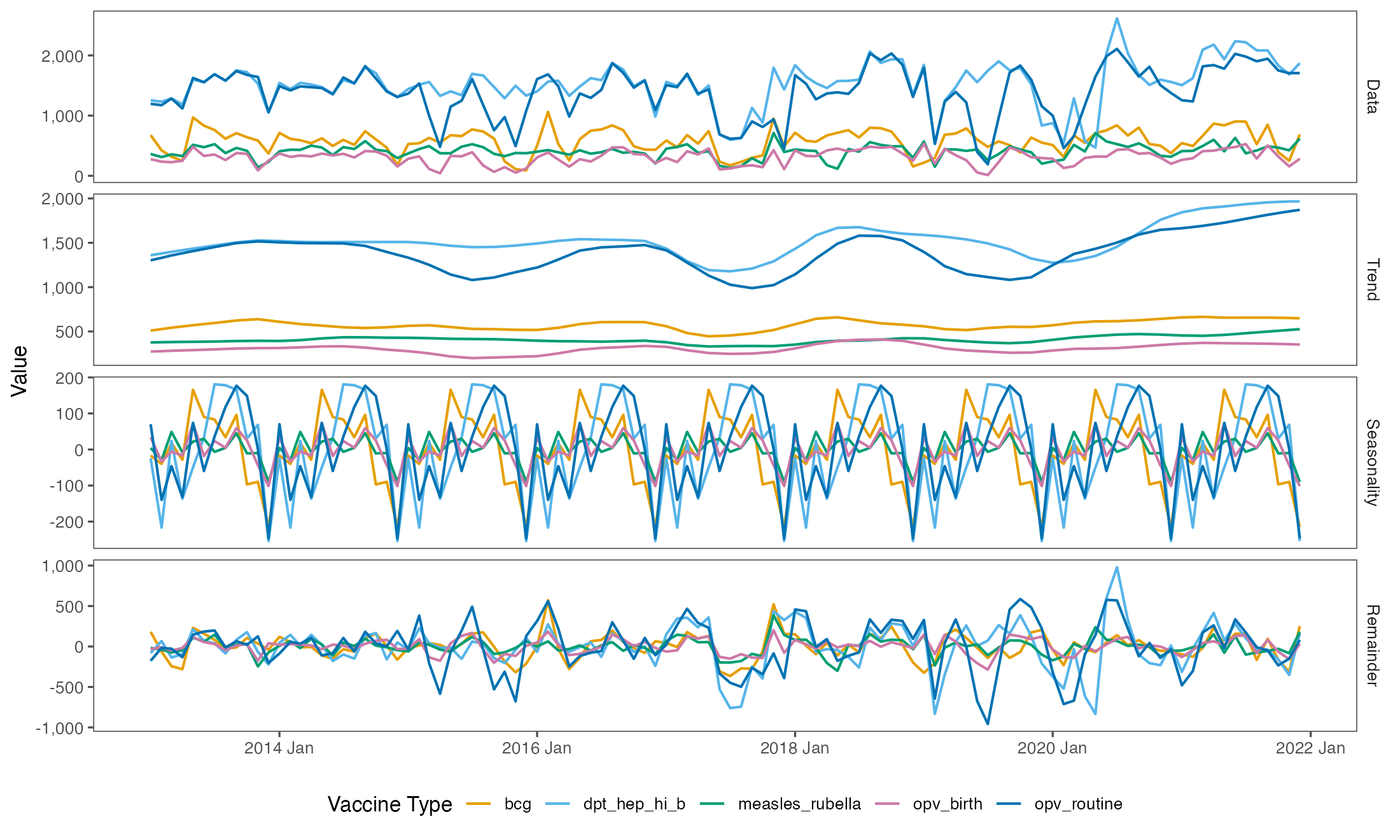
Trend, seasonality and noise, separated out. At district level the noise is large relative to the pattern, which is exactly why a range matters more than a single number.